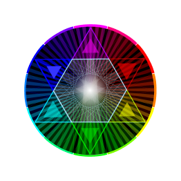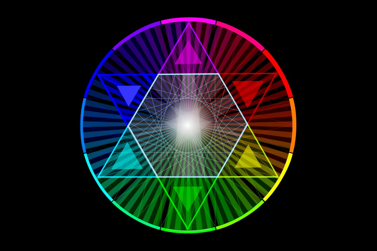
Goethe’s historical color legacy comes to us across the years through layers of translation and interpretation. Indeed, unless you are fluent enough in German to read Zur Farbenlehre, you are indebted to the scholarly work and artistic passion of Charles Lock Eastlake. A significant figure in his own right, Eastlake held many prominent positions within English society: President of the Royal Academy, the first Director of the National Gallery, and Keeper of the Royal Academy's schools before that. In addition, Eastlake was an accomplished painter himself, who studied in Italy, absorbing lessons about painting, figure and color from contemporary Italian masters.
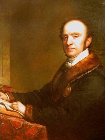
In his official role, Eastlake was an important gatekeeper of knowledge, with the ability to impact at scale the study and practice of painting in England. From his position, he witnessed the impact that Zur Farbenlehre had on the scientific community, and controversy caused by the polemic attack on Newton. Despite this, Eastlake saw beyond the attack and understood Goethe’s positive contributions to the understanding of color from an artist’s perspective.
At this time, in the early 1800s, Goethe’s work was available only in the original German, so it had limited direct influence in the English world. So, Eastlake, having determined the importance of Goethe’s work, undertook the task of translating Zur Farbenlehre into English, in order to advance English art pedagogy.
Eastlake released his translation, Goethe’s Theory of Colors in 1840, published by John Murray, London. Notably, Eastlake confined his translation mainly to Goethe's didactic material, leaving most of the anti-Newton polemic untranslated. His interest lay elsewhere — in how Goethe's theory of color could serve working artists, not in relitigating the scientific quarrel that had already been settled.
A translator’s job has its own flavor of alchemy; translations are not just word for word transcriptions, but a transmutation that takes the intent of the original work and brings it into life in a different language, with words that communicate both the fact and the flavor of the original. In his professional an avocational capacity, Eastlake was well suited for the role, and he performed it with exceptional dexterity, while injecting his own commentary that enriched Goethe’s original intent.
Previously, we encountered Goethe’s apex color, Purpur, which Eastlake translated as ‘purple.’ Now, my own interpretation, stated previously, is that Goethe meant a color closer to what we know as magenta, however, for various reasons that we are about to explore, this is not a translation error by Eastlake, but rather, a deeper example of the ineffable character of color experience, and the limitations of technology and color reproduction.
Here now, we are encountering the deceptively simple act of color naming (Farbwörter), which leads down into rabbit holes of perception, meaning and language, something that we will explore more deeply in the future.
We will begin simply; What color is ‘red’? What color is ‘yellow’? What color is ‘blue’? These don’t seem to be abstract questions. Children can tell you the answer with confidence, but there is something deeper at play — we can say an individual color is ‘blue’ but what happens when we put several kinds of ‘blue’ next to each other? What about ‘in between’ colors? There is a whole history of color naming that aims to distinguish these, but ‘colorful’ names confuse as much as clarify.
To illustrate this directly, let’s take Purpur as our example. First, here is Goethe’s own description:
“We are here to forget everything that borders on yellow or blue. We are to imagine an absolutely pure red, like fine carmine suffered to dry on white porcelain. We have called this colour ‘purpur’ by way of distinction, although we are quite aware that the purple of the ancients inclined more to blue.”
Against these rather dated and imprecise descriptions — which themselves show the limits of words in describing colors — we all have our own ‘mental models’ of color. So, rather than words, I will show you directly where the confusion (and answer) lies:

Using our eyes instead of words, the point becomes obvious: instead of a single color value, ‘a color’ is really defined by a range of colors; as you can see, there are many variants of purple here, each equally valid yet distinct from its neighbors.
The point, then, isn’t a debate about what color Purpur ‘is.’ It could be any of these colors!
Goethe himself pointed at the problem, though not by that name. Of Purpur, he wrote plainly: “It cannot be produced by intermixture or union, but only by arresting the hue in substances chemically acted on, at the high culminating point." Whatever this color was, according to Goethe himself, it wasn't something you could simply mix from a palette or see through a prism.
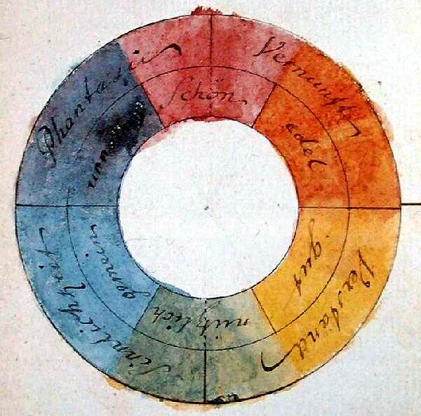
This is both the tell and the cornerstone: the original and the graphic illustrations you see when you search for ‘Goethe’s color wheel’ appear to place red at the top of the circle, opposite of green, which he placed at the bottom; looks like a normal Red Yellow Blue painter’s color wheel.
But the tell is this; magenta and red accord to different opposites. I won't tell you what those opposites are. Click on each image and follow the instructions to see for yourself:


So, while Goethe’s color diagrams may appear to represent red on the top, his own words indicate the truth: that Purpur is the apex, the a mystical mixture of red and blue that could not be reproduced — at the time.
Taken together, Goethe’s work must be reconsidered: his color theory was based on an incorrect speculation of the scientific origins of color, but one that aligned with Aristotelean thinking and more importantly, was an assertion of the mystical power of color, as something that cannot and should not be reduced to mere mathematics. His conception of Purpur is a pure representation of his conception of color experience as being the result of opposing forces uniting in a remarkable, otherworldly appearance, one that the science of his day could not reproduce.

Goethe’s diverse accomplishments and complicated legacy are such that there is yet more to come. Our next installment will look at how a clash between rivals reveals a remarkable concordance between opposites.