Goethe was a man of extraordinary range. Born into a comfortable, well-educated family, he trained formally in law and spent years in government service as a diplomat and adviser to the Duke of Weimar. But his lasting fame came from a different vocation entirely; he rose to prominence in his twenties as a poet and novelist, and by the time he turned to color, he was already one of the most celebrated intellectuals in Germany, a leading voice of the Sturm und Drang movement that prized feeling, individual genius, and the full expression of human sensibility over cold formality.
This is the important thing to understand about the kind of artist Goethe was. He collected art enthusiastically, and he sketched and painted for pleasure, using watercolors to illustrate his own color experiments. Yet he never considered himself a visual artist, and color, for him, was never an artistic medium to work with. His art was language; his instrument was argument, observation, and reflection carried out in prose. Where a painter might portray a color relationship on canvas, Goethe described it lyrically in a sentence. He was an artist of words, not an artist of paint — a distinction his critics, and even some of his admirers, have often collapsed.
It was this same Romantic sensibility, not scientific training, that shaped his approach to color. Goethe opposed what he saw as science's desire for reduction: its drive to explain the full richness of natural experience in purely mechanistic terms, stripped of feeling and immediacy. Against this, he held up human observation itself as the true measure of things, not an instrument's reading, but the embodied interaction between a person, their senses and the world. It was this conviction, more than any specific disagreement over optics, that set him on a collision course with Newton, and that shaped everything that follows.

Goethe’s 1400 page treatise, Zur Farbenlehre (Theory of Colours) was published in 1810. While Newton experimented solely with the physical properties of color (light passing through a prism or striking a surface), Goethe’s color theories were based holistically on the combination of physical color, surrounding conditions of light and dark, physiological reactions in the human visual apparatus and the psychological effect of color, effects related to the way our brains process information
Therefore, according to Goethe, the total experience of color depends on the object’s color, the lighting conditions and the human perceptual and sense-making apparatus — with the sum being greater than the parts.
As we learned previously, Goethe erred in his Faustian desire, by insisting that his color work be taken seriously as science, when in fact, his findings were subjective, and derived in service of his own ends. However, if we strip away the pretense towards science, Goethe had many insightful and valuable observations about color. Now, we can look at Goethe’s positive contributions to color theory.
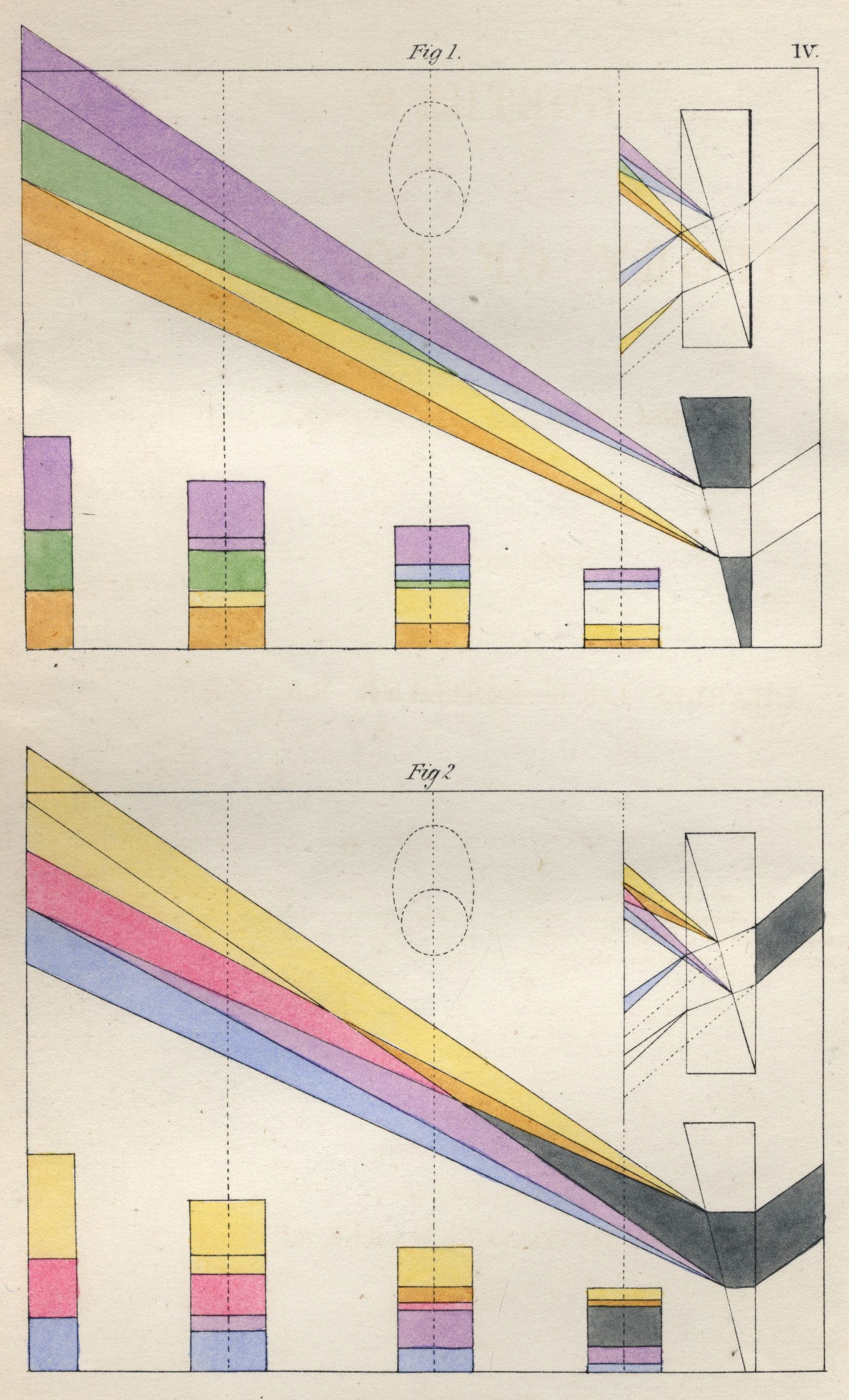
We can start at the beginning with Light and Dark. Goethe believed color arose from the interaction of light and darkness, and the polar opposites of white and black; and while he was wrong about the cause, he was right about the experience.
Color varies broadly between the two poles of light and dark. Light colors are bright, positive and forward, while dark colors are cool, calm and receding. For Goethe, this meant the first primary color was yellow, since it is the brightest color, next to white, which to him was a polar point of revelation in its interaction with darkness. “Colour itself is a degree of darkness," he wrote, meaning that darkness against light is what generated the experience of color.
Yellow and blue were, to Goethe, the Urfarben, the true primaries, the two poles from which all other color was generated. Each intensifies (Steigerung) toward red as it darkens — yellow reddening, blue reddening — until the two extremes meet. Notably, red itself never appears in the wheel as its own starting point — it exists only as a polar force acting on each primary color. Purpur is the apex where these two reddened extremes meet, the point where they fuse into something that belongs to neither primary alone.
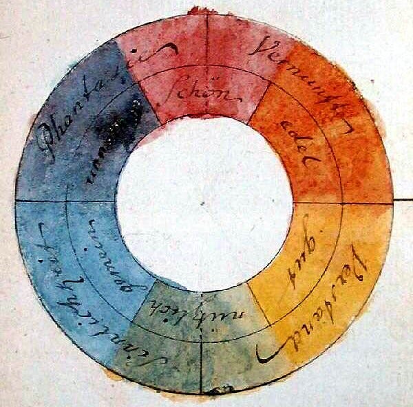
Here, we encounter color's intrinsic mystery, the gap between color naming and experience. Significantly, there is a translation gap, where Goethe's Purpur was rendered by Charles Eastlake into English as 'purple,' when in fact it is closer to red, or in a more interesting interpretation — magenta.
Goethe himself described Purpur as the color of a cardinal's carmine robes and the ancient murex dye — in his own terms, a red with no trace of yellow or blue in it, which is not the blue-leaning 'purple' we know today.
Let’s explore this idea: remember previously that Newton took the linear color spectrum and wrapped it into a circle, as a means of representing color relationships. While physically illogical, the key benefit of this arrangement is to make visible the opposition of colors, including ‘complementary’ colors.
It’s also important to remember that the color circle has never belonged to artists alone. Scientists, philosophers, dyers, and mystics have all used it as a way to visualize color relationships — interpreting it as needed to fit their own purposes.
In this case, Goethe was constructing a color circle that represented his philosophy of color, and the relationships between colors. That he illustrated his philosophy with a diagram rendered in watercolor makes it look, at a glance, like a practical tool for mixing paint. It is nothing of the kind.
Instead, Goethe’s philosophical color arrangement points at something more abstract and interesting. Here, we must re-examine the idea of the color circle more closely; in order to ‘close’ the ends, which are really the endpoints on the visible spectrum next to infrared and ultraviolet, a ‘synthetic’ color must be created, that is , one that doesn’t exist on the visible spectrum, which we know today as magenta — which is actually an optical mixture of blue and red.
While it took a later generation of scientists to describe this aspect of human color perception, Goethe was representing it in his conceptual color wheel as Purpur, an emergent color caused by the interaction of the two color primaries. Now, if we ignore Goethe’s incorrect assertion about blue and yellow primaries and instead look at this color as being the mixture of two endpoints, we can understand it in a way that is fully congruent with modern color theory.
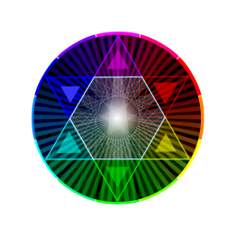
Look at the Colormxr illustration below, showing an RGB+CMY color circle rotated to match Goethe's intent, with purpur / magenta on top. That identification — Purpur as magenta, not red — is confirmed by Grün / green in Goethe's original diagram, which he placed directly opposite it as its Gegenfarbe. Green is magenta's complement in modern color theory. This pairing proves which color Goethe actually meant, which supersedes translational and visual interpretations.
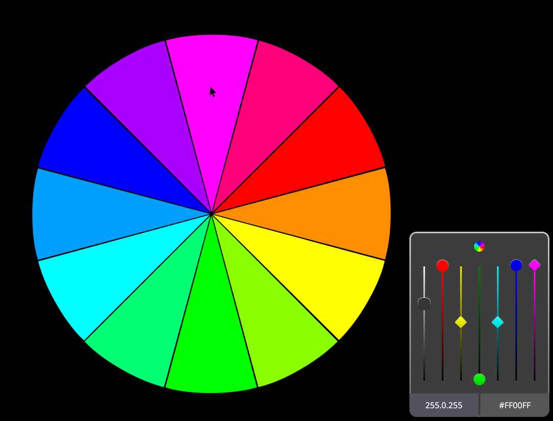
Now, we need to return to Goethe’s philosophical color construct, in which, it is popularly (mis)understood, that Goethe placed red at the top, as the superior color, above all others. This seems like a pretty common sense claim, in that red is an extremely vibrant color, associated with fire and energetic projection. However, if we read it in a different way, the philosophic angle becomes much more compelling.
The top of Goethe’s color circle, chosen by him for philosophical reasons, is not actually primary (for us) red, but Purpur, which is not actually purple but an intermixture of red and blue, aka magenta. Why is this claim so noteworthy? Because magenta has a mystical property — you can’t find it using a prism, it is not a color found in nature; instead, it is a union of two disparate colors, at the opposite ends of the spectrum, which are united here via ‘the alchemy of color.’ Goethe was describing a mystical union of color, created from the interaction of two opposites, which revealed an emergent phenomenon of color.
The orientation of Goethe's own manuscript diagram quietly carries this meaning; yet, it is often misrepresented as red due to the limits of color reproduction and understanding. Furthermore, if you search for his color wheel today, you will see examples where his color circle was rotated so green, or another color is on top, an indication that the poster didn’t fully understand Goethe’s theory of colors.
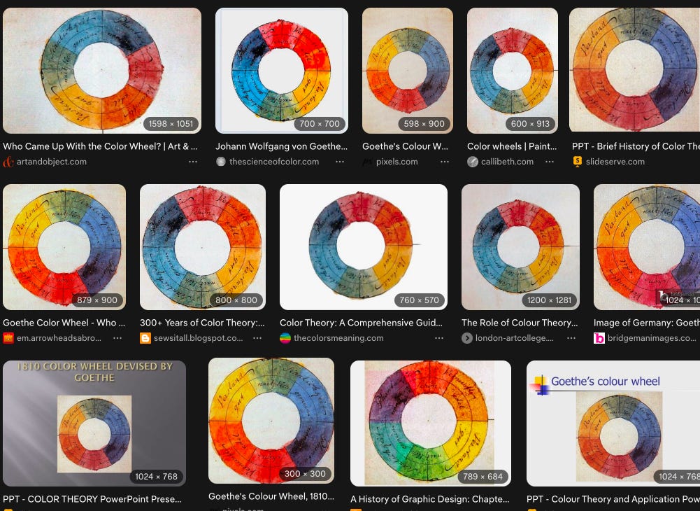
In addition, there is also the microcosm-macrocosm move at the heart of Goethe’s natural philosophy. encapsulating his main philosophical (and alchemical) tenets, polarity (Polarität) and intensification (Steigerung), which were Urphenomenon, the foundation of his entire worldview, underlying plant morphology, anatomy, geology and nature in general. In Goethe’s analysis, across his studies in these areas, two opposing poles interact and by doing so, intensify their characteristics, resulting in a transformative union.
And this is where the alchemical and metaphysical converge, the coniunctio (union of opposites, producing transformation) that Ronald Gray identified in Goethe's color work; it isn't a separate, add-on alchemical reading bolted onto an otherwise secular scientific theory — it's the same structure as the Polarität/Steigerung method itself, just named differently by two different traditions.
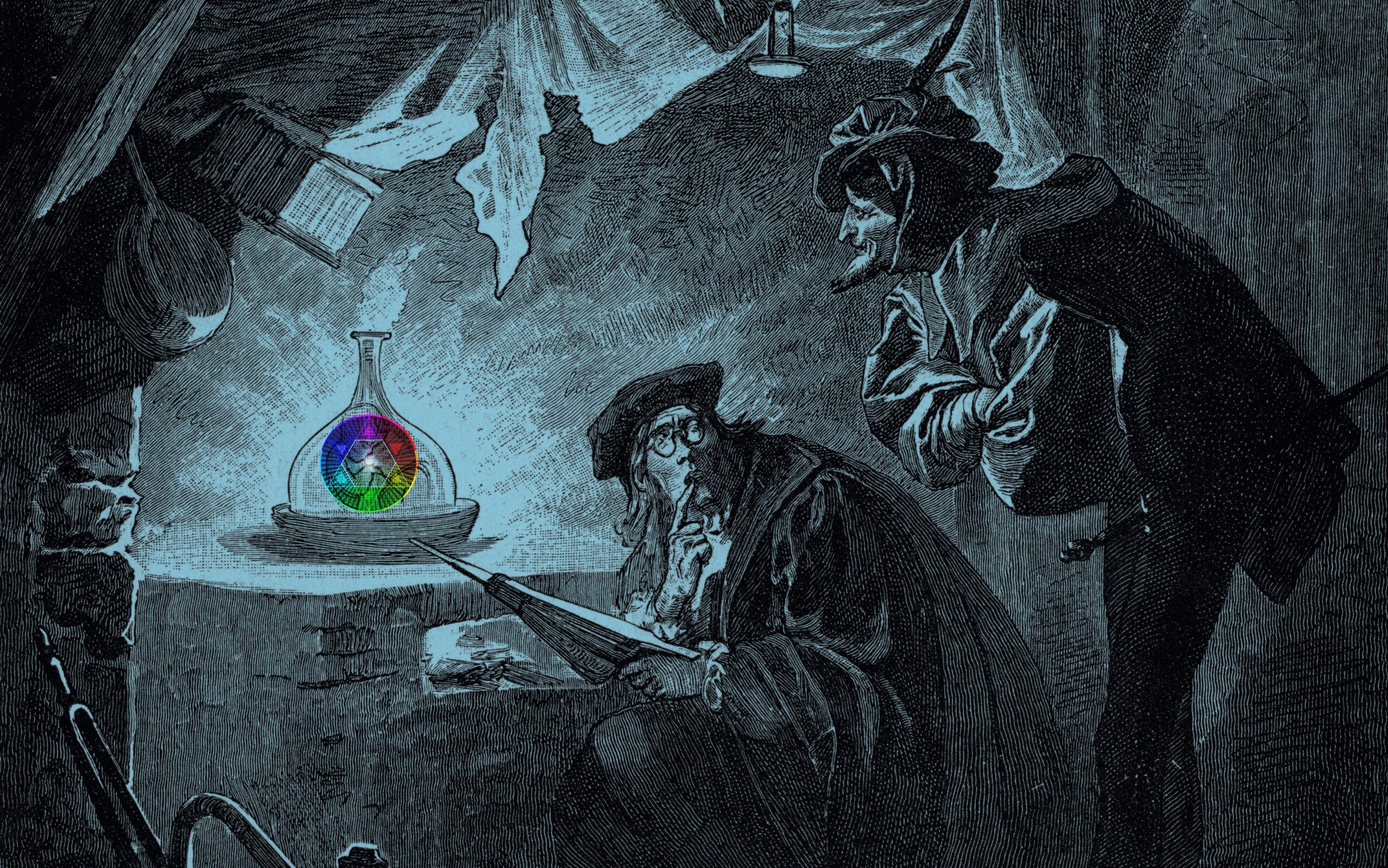
Goethe's youthful alchemical education was more than just a curiosity. Instead it informed his worldview in life, giving him the syntax of the Great Work as an intellectual framework. Therefore, Purpur isn't just a color Goethe placed at the top of a wheel, it's the one point in his entire body of work where his philosophy achieves exactly what it was always trying to do everywhere else. Its hidden roots are exposed in the light of alchemical transformation, where opposites unite to create something greater than the sum of its parts, not addition, but ascension.

So far, we have viewed Goethe’s life and work from many different angles, each providing a different insight into his wide ranging accomplishments. Going deeper than his Faustian desire to have his color theories validated by the scientific community, what is revealed is a humanistic approach to color as a holistic experience and color theory that represents richer philosophical and alchemical principles. In this light, Goethe actually delivers something more essential about color than is otherwise known about him biographically. Read properly, his color theory is not a practical artist’s guide to mixing colors, but a deeper reading of color interaction — informed by alchemy.
In our next act, next we will examine the legacy of Goethe’s color theories and their influence on visual arts.