LeBlon’s Coloritto was one of the earliest practical accounts of colormixing, and yet, it’s impact at the time was not as great as it would become in posterity. We are now skipping forward in time a few decades to visit another landmark in systemic color.
Moses Harris was a entomologist and engraver from the mid 18th century, some decades after Coloritto was printed. As with LeBlon, Harris combined technical and artistic skills with a practical bent.
Naturalists were among the most desirous for a system of color, for their work depended on it. The illustration of flora and fauna were important additions to naturalist studies and classifications. Harris himself studied butterflies, and their colorful appearance is a key identifier in their classification, therefore, color illustration and reproduction were of top importance.
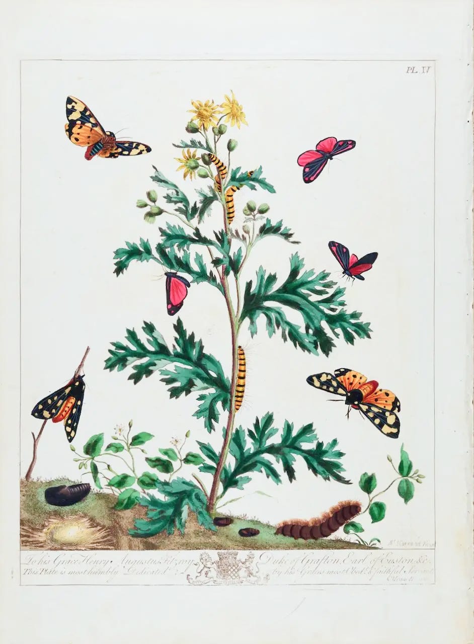
Trained by his uncle in entomology, Harris spent close to twenty years collecting, breeding and observing butterflies. Unlike LeBlon, Harris’ engraving skills were obtained as a means to an end, in service of his entomology. His major work, The Aurelian, published in 1766, was a folio of hand-colored engraved plates showing the life cycles of butterflies and moths. His color illustration process involved engraving the plate images and then mixing watercolors to match living specimens, and applying color to the engraved illustrations. His craft process was thus the foundation of his coloring technique, and his desire to create a systematized approach to color.
In 1770, Harris published The Natural System of Colors, which advertised:
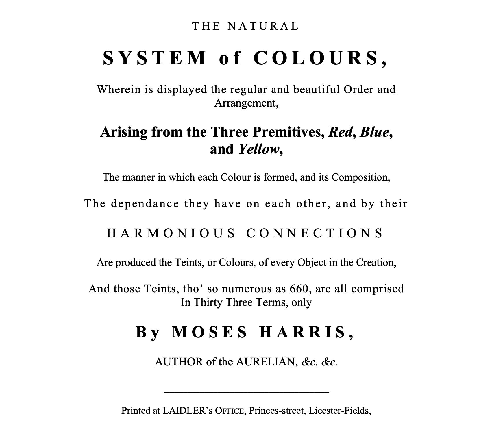
Here, Harris laid out a systemic method of practical color theory and color mixing. As we’ve shown previously, the ideas were known and shared amongst artists, but had not yet been collected and presented to the public in a systematic way.
Harris, following the informally accepted convention, derived his color circle from what he called primitive, or primary paint colors, Red, Yellow and Blue, and their mediates, or secondary colors, Orange, Green and Purple, as derived from an intermixture of twod primary colors. Quoting Harris’ treatise at length to fully describe his system:
“To begin with the first or prismatic part, it has been said before that the three primitive colours are red, yellow, and blue, and from which all other colours are supposed to originate, they are the greatest opposites in quality to each other and naturally take their places at the greatest distance from each other in the circle. Between these respectively are placed the mediates, viz. Orange, Green, and Purple, for if red and yellow be mixed together they will compose an orange: and therefore it is placed between the red and yellow. If yellow and blue are mixed together, green is produced and accordingly takes its place between those two colours, and to blue and red producing a purple, the purple must be placed between them.”
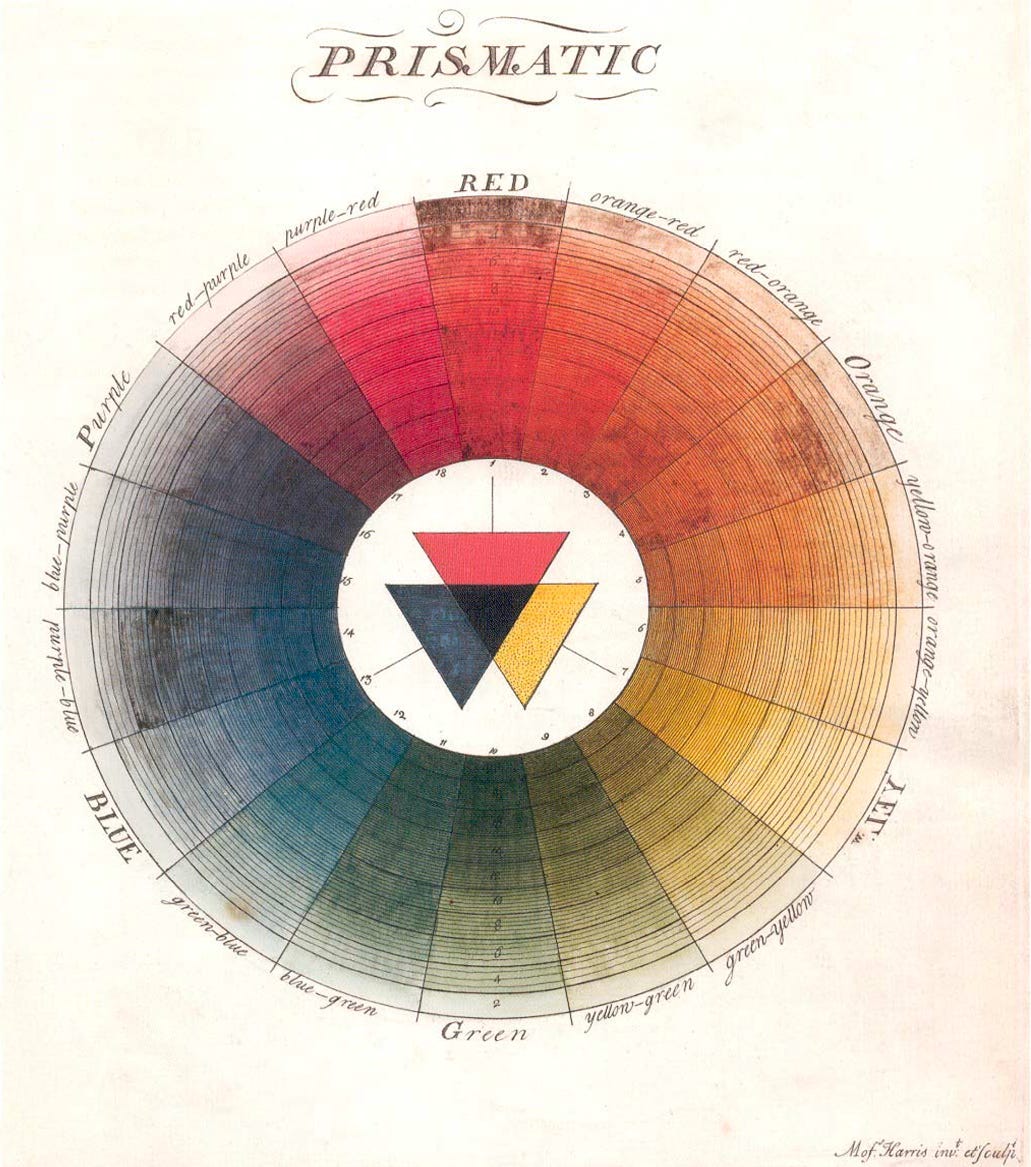
His was the first published systematic illustration of a full color wheel, meaning intermixed colors between the primaries and secondaries showing a full range of intermediate colors, or teints, the 18th century spelling of ‘tint’ from the French teinte—which at the time meant any color tone.
Harris’ Prismatic diagram, showed colors derived from Red, Yellow and Blue primaries, using using ink hatching to simulate the effect of shading and washes to simulate tints. A range of 360 colors. Harris’ second diagram, Compound, showed colors derived from the mediates, the secondary colors of Orange, Green and Purple, and additional 300 colors.
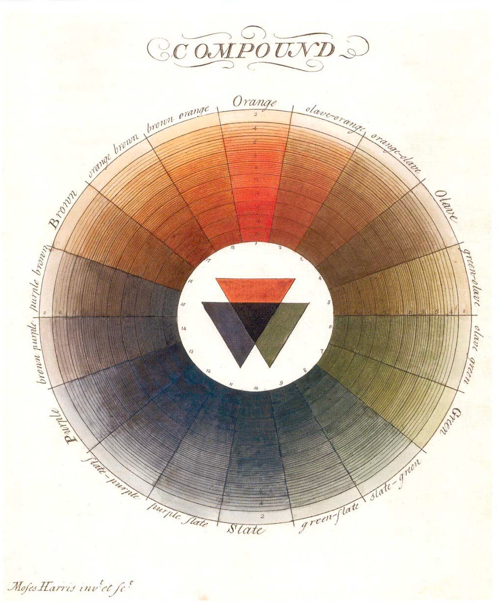
The biggest impact was visual; These diagrams stood in colorful contrast to previous color circle illustrations, which ranged from no color (Newton) to basic arrangements of prismatic or primary colors which only showed 6-12 colors.
Thus, Harris systematized the mixture of primary colors, providing a practical boon for naturalists and artists alike, giving them a means to classify and reproduce colors. In his treatise, Harris explained the importance:
“It was thought necessary to say so much respecting the use of this system in contrasting colours: as it not only illustrates and in some measure serves to confirm the property of the principles on which it is founded; but opens a door whereby farther information may be obtain’d respecting the mixing and blending of colours, and seems plainly to point our the reason why the science or systematic knowledge of colours in general hath been so dark and occult, as there has been no form, or mode, for mixing the various teints wanted in a vast variety of subjects painted. Many ways are commonly try’d by the young artist in mixing, or compounding teints, and nothing but experience in consequence of many attempts can set him right, and this is a difficulty with which he is always teazed, when his ideas are fixed and deeply bent on some other object.”
Notice that Harris himself characterize his system as scientific or systematic, in opposition to the ‘dark and occult’ act of mixing colors by intuition!
Harris’ other notable contribution was to codify the role of the color circle in terms of illustrating the relationship of opposing colors (the term ‘complementary’ was not yet introduced). In doing so, Harris was again putting into print what was by now commonly known amongst painters.
Beyond the well known contrast of opposing primaries, Harris went further by describing what would later become known as simultaneous contrast, by describing the appearance of it in practice:
“About the time of twilight in morning or evening, light a candle and set it on a table near the window, a sheet of white paper by it, so that the paper and the candle may be in a parellel line with the window; then hold a piece of stick upright with one end on the paper, so that the candle by its light may throw the shadow of the stick on the paper, which will be of a very fine blue colour, this appearance arises from the orange colour which the flame of the candle casts all over the paper, except that part shadowed by the stick. Look into the prismatic system which will account for this, by informing the reader that blue is the contrast to orange.”
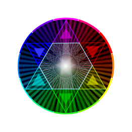
Here is an illustration of this phenomenon. To see the effect Harris describes, gaze steadily at the central color for several seconds (the longer you gaze, the stronger the effect), then shift your gaze to the edge where the gray background meets the color.

Once again, Harris was publishing an account of an effect that was known within the arts, but not yet published to a wider audience. This effect later assumed greater prominence and importance, as we will see later.

Harris published a milestone in practical color theory, yet, like Le Blon, the impact was limited in his day. Fewer than 10 copies of the first and second editions still exist; unlike Le Blon, Harris’ color illustrations were hand tinted, which limited the amount produced. A second edition, printed in 1811, helped to revive the book, however, its place in color legacy wasn’t really secured until 1963, when Faber Birren reproduced it and placed it in the lineage of 20th century color education. Since then, it has become widely prominent as an artifact of color, both as a standalone artifact and as a totem in color histories, blogs, posters, and coffee table books such as Alexandra Loske’s The Book of Colour Concepts (2025).
What then, is the place of Moses Harris in The Alchemy of Color? Here is my take: Harris indeed occupies an important spot in the history of color, by codifying a set of color practices and publishing them for posterity. However, his enduring fame also rests on a peculiar kind of alchemy — the bestowing of truth by beauty.
The ‘truth’ of color is complicated. Harris’ diagrams represent a legitimate system, and they have done real service by showing artists the relationship of opposing colors, and by representing tints and shades in a relational illustration, Harris ‘filled in’ the color circle with intermediate tones, indeed producing a ‘full color’ system of color.
Yet, on closer inspection, there are real gaps. For example, the appearance of teints or tones are actually created by thin lines of concentric circles, which darken the apparent tone as they get closer to each other. This means that the color effect of the tones is not created by color mixing alone. In reality, Harris actually used a graphic technique to simulate the colors in his theoretical system! Even the ‘pure’ hues and tints have line work over them, which technically shouldn’t be there — however, the overall unity of the illustration depends on the regularity of the lines.
So, the enduring impact of Harris’ color circles owes a hidden debt to the fine engraving work that Harris did. As a graphic, it is undeniably aesthetically beautiful. It appears to be complete and systematic, yet on closer inspection, shows some other imperfections; the Purple section, for instance is nearly gray, due to the practical difficulty of getting a vivid Purple from a mixture of Red and Blue. The same holds true for Green, where Blue and Yellow combine to produce a muddy mixture. These are material imperfections that are inherent in the medium and deficiencies in pigments, where theory and reality don’t line up.
In his text, and to his credit, Harris states as much, that the plates are meant only to “direct the eye,” that he “treats on colour in the abstract,” admitting that red and blue won’t make “a fine purple, which every painter knows.” The problem is that the images traveled without the text.

Color deceives the eye because its appearance continually changes depending on its surroundings. It can dazzle, overwhelming with brilliance or beauty, to impress so much that judgement is suspended. This characteristic was at the center of a longstanding academic dispute within the arts, known as Disegno versus Colore. While this is a topic of greater examination for another day, the central point was this: color was distrusted and denigrated by some authorities because of its ability to dazzle and deceive.
In aesthetics, beauty is a loaded condition. Beauty unconsciously confers a measure of authority and truth. This relationship was summarized by the poet John Keats who said ‘Beauty is truth, truth beauty.’ To be clear, we cannot fault Harris, or any other artist for portraying beauty, for it is part of the job description.
The crux is a fine point: there is ‘a’ truth in Art, but it is different than the ‘objective Truth’ that is sought by Science. The deception of the aesthetic eye is a different matter than the deception of the rational mind. We may see this in many ways: an artist’s sleight of hand may turn one into the other; a scientific stance may declare one perspective to be the absolute truth; or, a viewer’s unconscious mind may do the same without intention.
A rational system implies a scientific truth just as aesthetic beauty implies a different kind of truth, one that is not binary, but contains multitudes. There is truth in this beauty, even as its aesthetics hide some flaws, limitations and misdirection. The aesthetic truth in Harris’ illustrations is quietly accepted as systematic truth. The alchemy of color cuts both ways.